


From Sketchbook to Supernote Nomad
Showing all my e-inktober arts before October ends + long honest review (once again, not sponsored!)

Previously:

There’s something quite immersive when it comes to drawing on an e-ink tablet that my iPad Pro fails to emanate.
Aside from being easier on the eyes, I feel like the experience e-ink offers is almost like writing or drawing on real paper. That analog, distraction-free environment (plus long battery life) is definitely what draws people to these devices.
So if you’re hoping to get an e-ink tablet as a replacement for an iPad and expect it to boost your productivity, you’ll be disappointed. You need to adopt a different mindset, one that lets go of instant gratifications and digital merits.
Think of it as a minor upgrade from using paper or a sketchbook, except you’ll never run out of both.
The Supernote Atelier App
There are plenty of reviews on using the Supernote Nomad for note-taking (a.k.a digital notebook), so I’ll save us both the explanations.
However, I found few reviews on the Atelier drawing app, mostly just art examples. One detailed review by Vladimir Kostek on YouTube stood out, and I recommend it to anyone seeking an in-depth look.
But watching videos wasn’t enough. I needed to try the tools myself.
So like any new drawing programs I’ve tried, my approach is to jump right in, using the tools as closely to my workflow and style as possible.
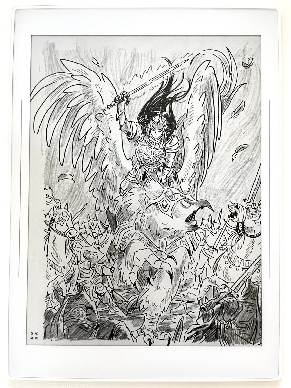
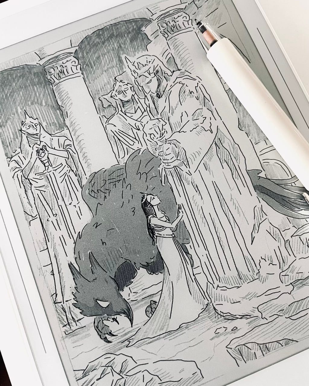
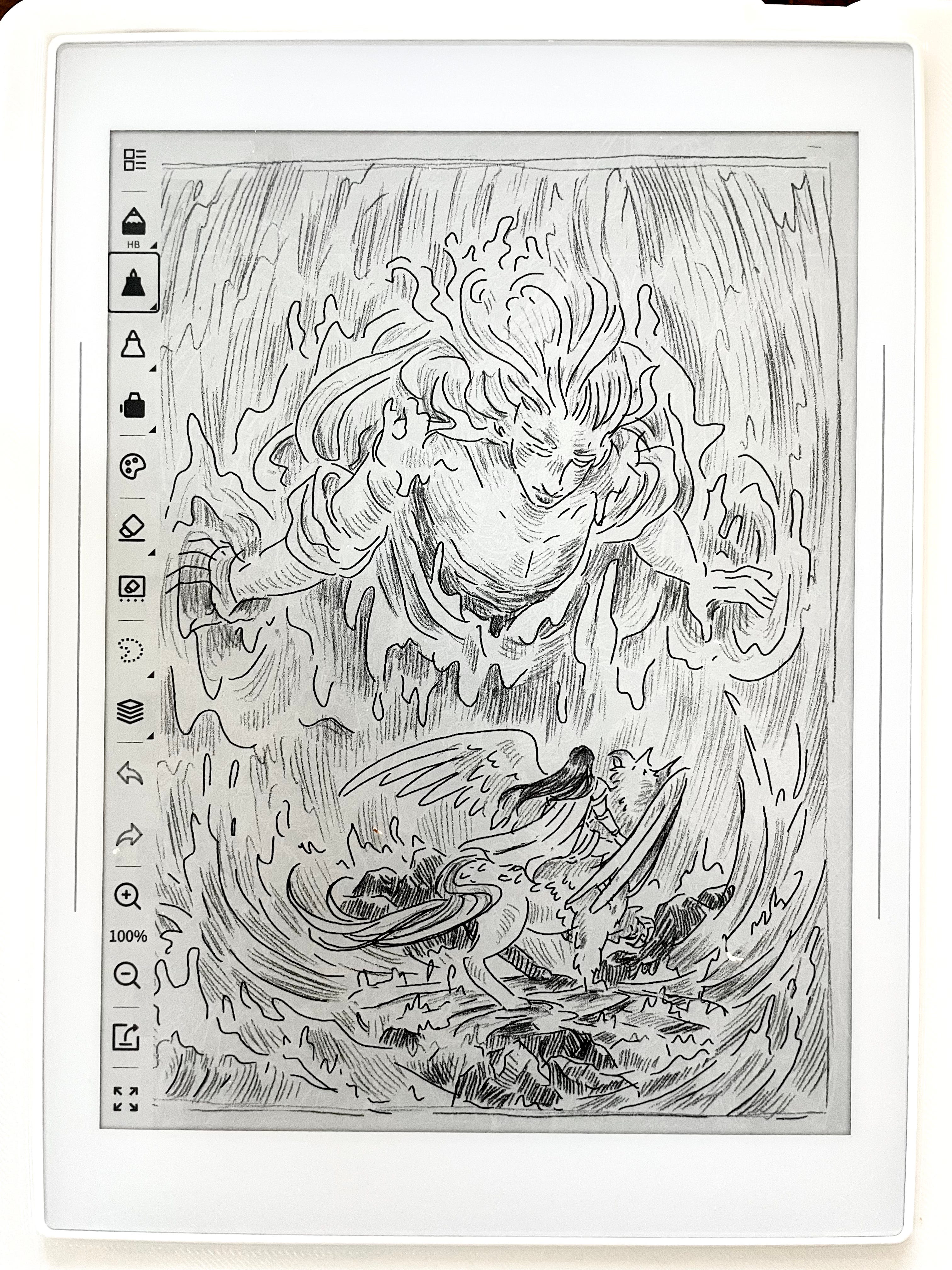
To test it out, I decided to use the Inktober Queentober prompts as a warm-up.
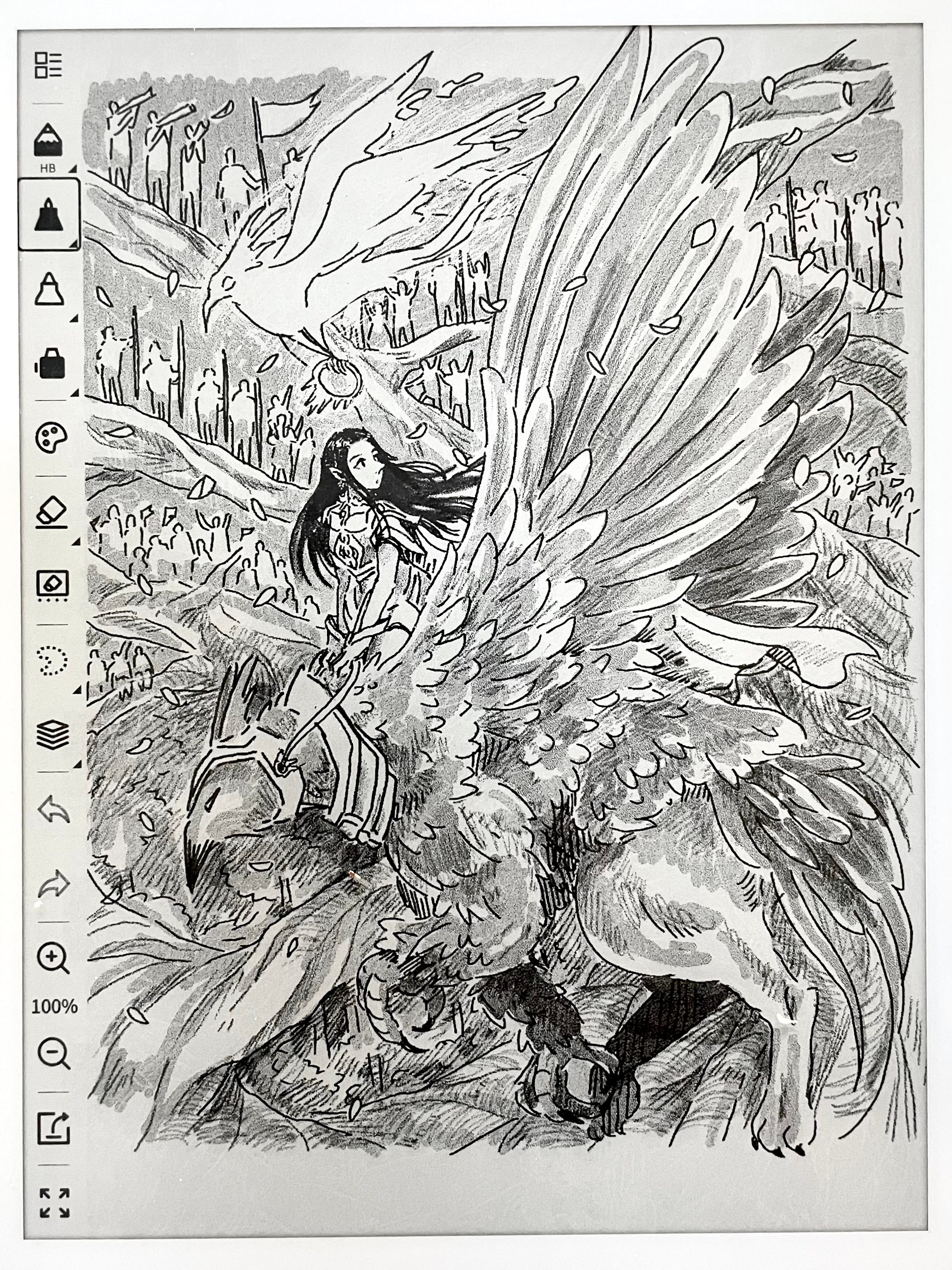
Below, I’ll be sharing my first impressions with the Supernote Atelier tools and providing my own feedback.
Ink Pens
First, I tested out the Ink Pens because y’all know I love pens.
Unfortunately, there’s no way to change the brush size. This is why some prefer using the Notes app for drawing since you can adjust the size there.
However, there are still some variations you can use, and I’ve found that the Hatching Pen gave me the smoothest lines, almost like monoline pen.
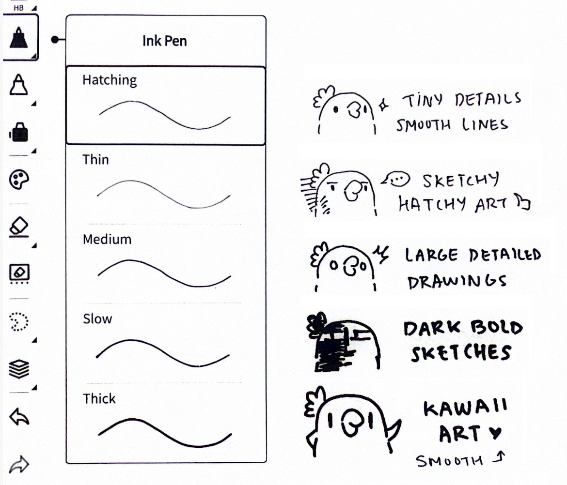
Thin gave a real ink feel with ink blobs/blots, which I would use for quick plein air sketching and ironically, hatching.
Medium, is like the bolder cousin of Hatching. Great for bigger drawings.
Slow and Thick are quite similar and I mostly use it to fill in darks. I also think Thick has enough stabilization to create vector-like arts.
Artist Feedback:
Changing the brush size is a must.
Provide better names for the Ink Pen list that actually matches what each pen does or resembles. Slow and Medium just sounds… odd?
My Suggestions: Mono Line 0.2, Fine Tip 0.1, Gel Pen (adding point sizes would be super helpful if they don’t plan on implementing brush sizes).
The Spray
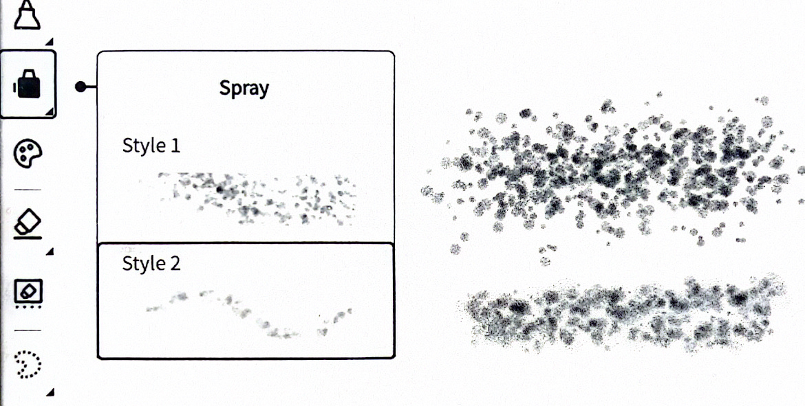
It is by far the most ineffective tool. It reminds me of the spray from old MS Paint (not that anyone remembers…).
I wouldn’t have touched it if it weren’t for this post.
Artist Feedback:
I think the devs should swap it for a flip canvas option, lasso/bucket fill, or even… watercolor brushes! Quite ambitious, I know, but I can still dream.
The Markers
Like many others, I use the marker for filling in color and shading. The grayscale colors have a sort of grainy texture that looks great on the Supernote screen and camera.
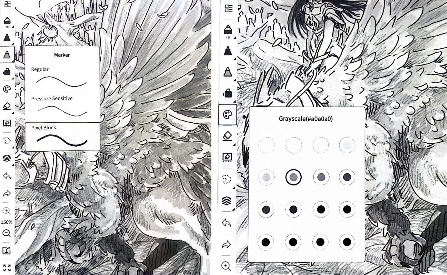
However, the grayscale colors look “shimmery” when exported, creating a dithering effect. The only fix is to scale the image up (or down) in Procreate, so the texture blurs out (it’s kind of hard to explain).
The easy solution is to skip coloring on the Supernote and add it later in a different drawing app, which was what I did for the rest of my Queentober arts.
Artist Feedback:
Better export rendering is needed.
The last two rows of grayscale tones are unecessary, as they barely differ from one another. When you export, the shades tend to darken, so all those dark grays will eventually turn into some degrees of black.
Implementing a grayscale color wheel would be great, though it might be pushing the e-ink technology.
The Eraser and Layers
I’m surprised the Eraser list has far more variations than the Ink Pen list (it should almost be swapped!). But I found myself sticking to just one eraser type: the Soft & Thin, and the lasso tool to delete large chunks of section.
Still, I try not to erase too much while drawing on the Supernote, as I like to limit myself to mimic real-life sketching.
Speaking of limitations, the Atelier app only has 5 layers, folks! Which is pretty generous, if you ask me. I expected 2 layers, honestly.
For the Queentober warm-ups, I found myself using all the layers though (laughs) because I wanted to take advantage of every single one to experiment.
Artist Feedback:
IF Supernote ever adds the option to adjust the eraser size, then one good eraser is all you really need.
I wish there was a way to select multiple layers and transform them together.
Adding opacity for layers would be amazing…
The Lasso/Marquee
Surprisingly, using the lasso to scale your drawing shows less pixelation, and doesn’t lose too much line quality compared to Procreate despite it being a raster-based programs. So this was a welcome surprise.
Pencils!
I know I’ve told people online that I’m not a pencil person, but I totally forgot to mention my secret love for shading with pencils.
Back in middle school art class, my teacher even nicknamed me the Shading Machine. Those days might be behind me, but I can feel that passion coming back when I use this Atelier app.
Instead of using the markers to color (like I did with the first Queentober prompt), I switched to pencils. It’s way faster, way smoother, and way more fun!
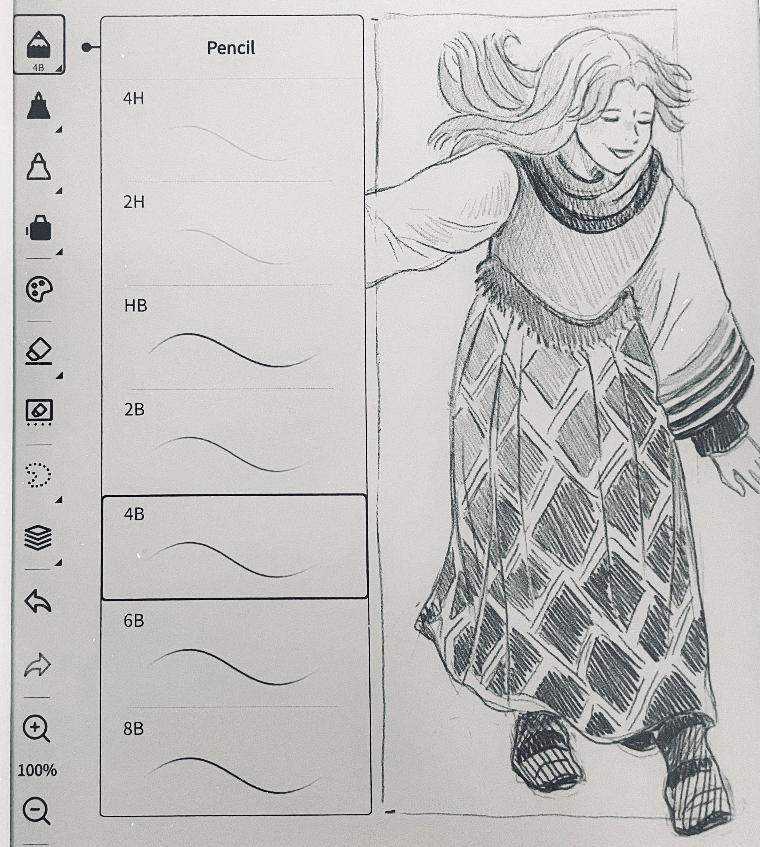
I’ve been using the 4B for bold, dark shades/lines, and anything above that (4H-2B) for lighter shades or rough drafts.
Artist Feedback:
If the devs can add a smudge or blending stick… I’ll cry.
Overall Impression
I might come off a little biased, but this is purely based on my own observations and my e-ink journey so far.
Drawing on an e-ink tablet lets me be more expressive with my lines, something I had difficulty doing with my iPad Pro. I was skeptical at first; I didn’t expect it to feel anything like drawing on paper, and of course, it won’t be 100% the same.
But how do I describe it? There’s a certain feel to it.
It’s like my mind slows down and focuses, just like when I draw on a sketchbook. I can spend hours staring at the screen without straining my eyes, and I don’t have to waste paper anymore. In a holistic sense, I just feel… better.
The Supernote Nomad is also way less conspicuous than my large iPad, and I don’t have to fumble around to open my sketchbook in public (and get all the weird stares).
Again, this is just me, and I don’t speak for everyone. I can only hope to see more artists adopt e-ink tablets in their creative process and share their own thoughts.
The “Not-so-great”:
Navigating the canvas requires a lot of guesswork.Export quality is questionable.No mirroring: You can’t mirror your image selections even with the transform tool.
Sometimes there’s a bug where a section of artwork will disappear in shapes of block or tiles. I feel like it has to do with some file moving/syncing error. To avoid that, I ALWAYS save a soft copy on my PC or iPad when I’m done.Hand/palm rejection doesn’t work when side tool windows are open. So when you open the brush list and your palm slightly touches the screen, the window disappears before you can select anything.
Cannot move the toolbars around like you can on Notes. Lefties will find that a great annoyance. (but I heard there will be an update for that)No way to adjust brush and eraser size.
Edit: Dec 5 2024 —Supernote has released an update for the Atelier app (on beta) and have fixed the disappearing art issue, png export quality, and you can now move the tool bars (there you go, left-handers).
April 8 2025 — Supernote released an update for custom canvas sizes! You can also export in PSD file. Now, navigating the canvas is easier.
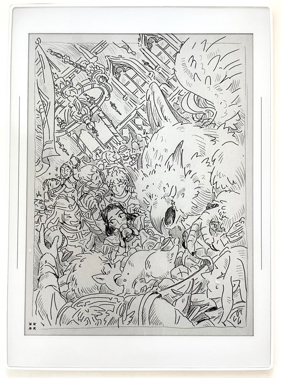
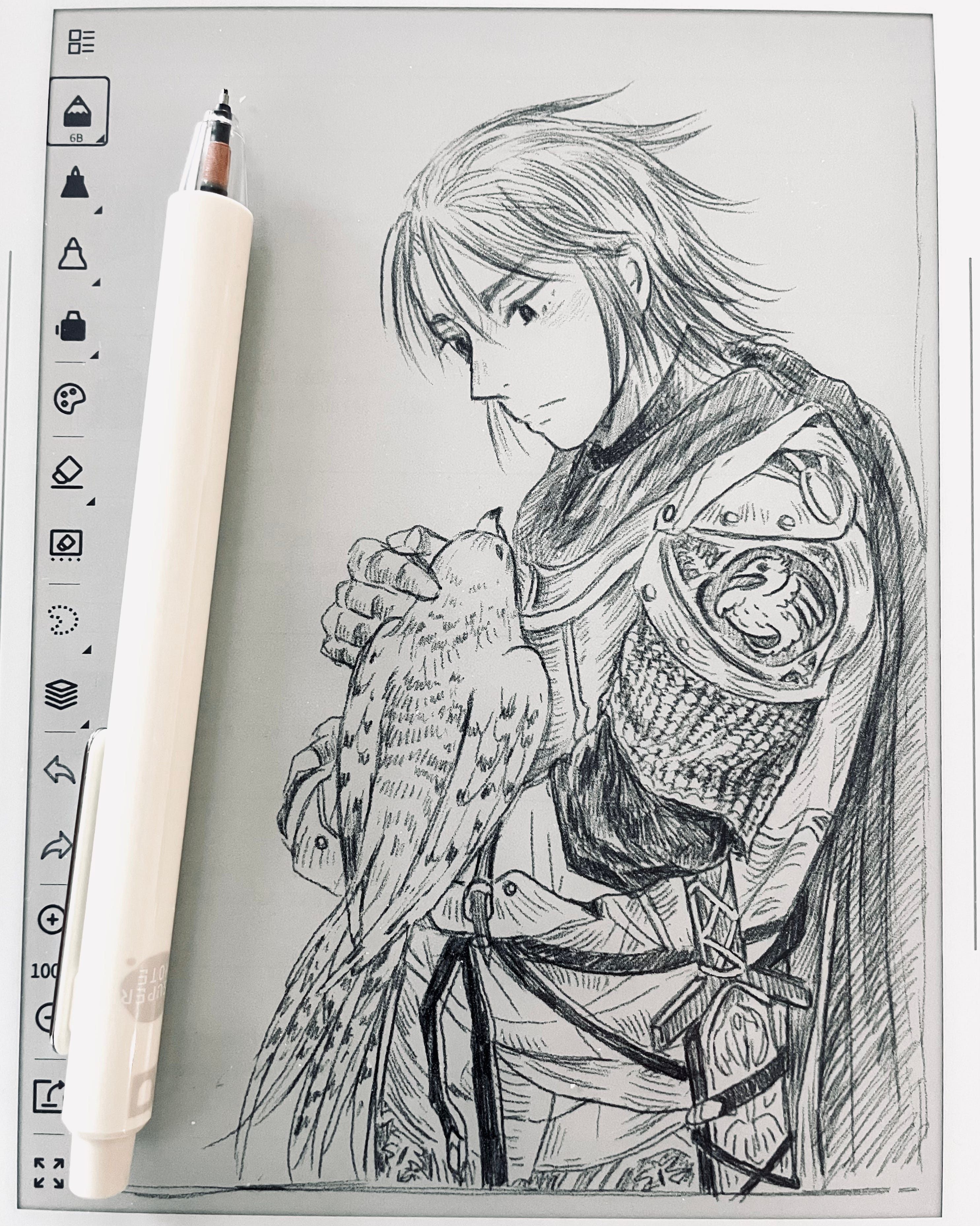
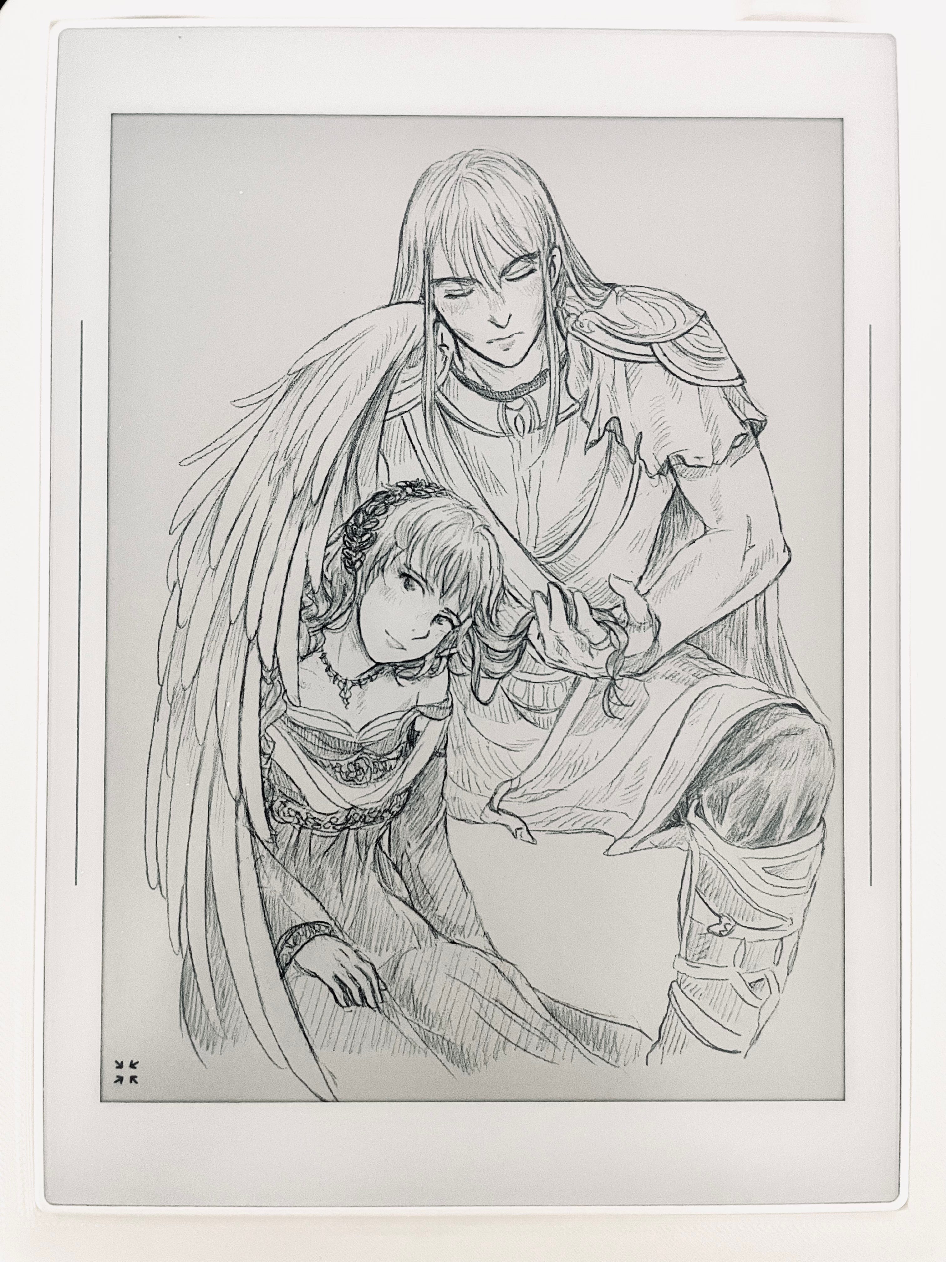
E-ink Gallery Dump


How many of you are interested in an e-ink tablet? Would you like to get your hands on one?
I had never heard of E-ink before reading your posts, so I am super happy you have introduced me to this option! It'll be on my radar for possible art supplies to try in the future!!
I really was thinking of getting an e-ink tablet. But I just felt silly because I already have an ipad. Thank you for the review. I was looking at the remarkable tablet because they released a new model, lots of people are selling their old one when they go to upgrade.