


Artist Review of the Supernote Manta A5 X2
A digital sketchbook all artists should be hyped about... said no one ever.

Before I began…
Can we all give a moment for those who’ve been waiting over two years for the A5 X2 (Manta) to arrive? Yeah, big sighs of relief all around. As for me, I only waited two months, so I wasn’t part of the restless, angry eager mob.
But don’t get me wrong, I was just as excited. This wasn’t just any tablet; this was the one I’d been eyeing to take my drawings to a whole new level. So the anticipation was real.
Why all the hype?
Well, let’s get down to the technicalities.
Disclaimer: I’m still new to e-ink tech, so I’m no expert. Feel free to correct me or add in. I’m only going to discuss things that I find are beneficial to an artist. So if you’re looking for detailed specs and software information, this review is not for you.
The Supernote A5 X2 Manta is among the e-ink devices in the market to integrate both Mobius display and Carta 1300 (the other contender is Viwoods AI Paper, from a relatively new company). It’s the latest e-ink display technology that boasts its screen flexibility and durability (so no need to panic if you drop it!). The visual quality and high contrast is better compare to older e-ink models and e-readers. And finally, with 300 PPI and a bigger screen, it has the potential for drawing any quality work.
And then there’s the unique writing experience, that I still have a difficult time explaining.
But what I can explain is the low latency or “lag time,” which is basically the delay when pen interacts on the e-ink screen, and this— is extremely important for writers and artists. The lower the latency the better. And it seems Manta achieved it by swapping out the glass screen used in the Nomad for a flexible plastic one. This not only reduces the distance between pen and display, but it also adds a slight texture, thanks to the FeelWrite film, that feels oh-so-satisfying to draw on.
Overall, I’m quite impressed by the build and quality of the Supernote Manta.
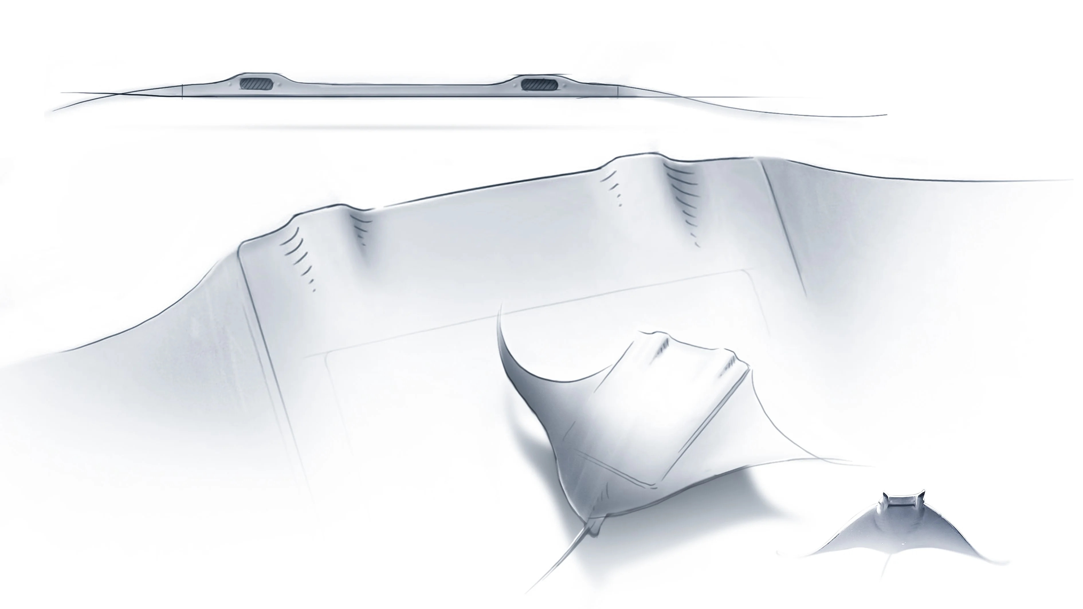
Fun Fact: the design was actually inspired by the body of a manta ray. You can read more about their design story here.
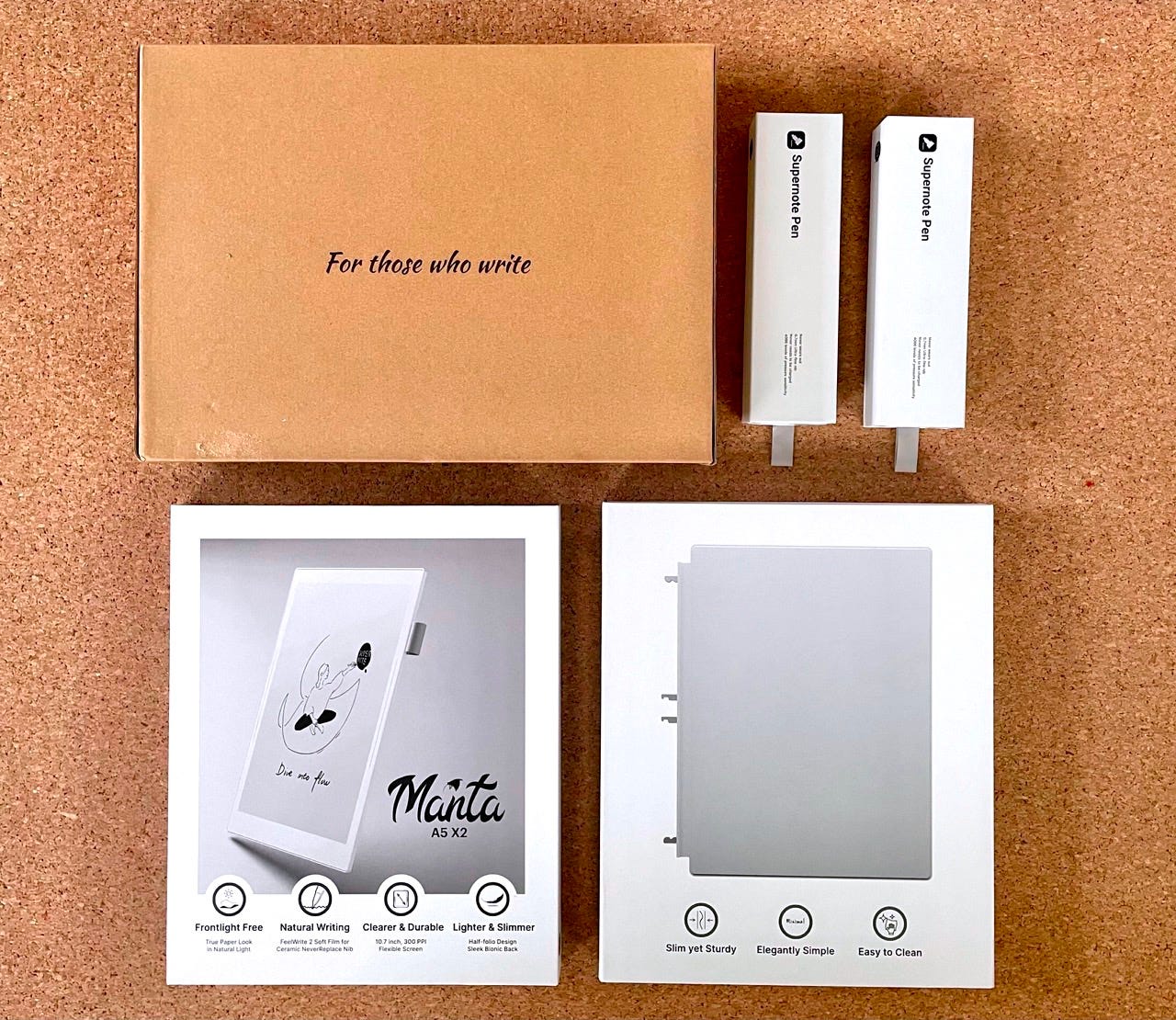
One thing I love about Supernote devices is how your drawing (or writing) experience depends on the pen and nib you use. The team at Supernote was kind enough to send me two pens to try:
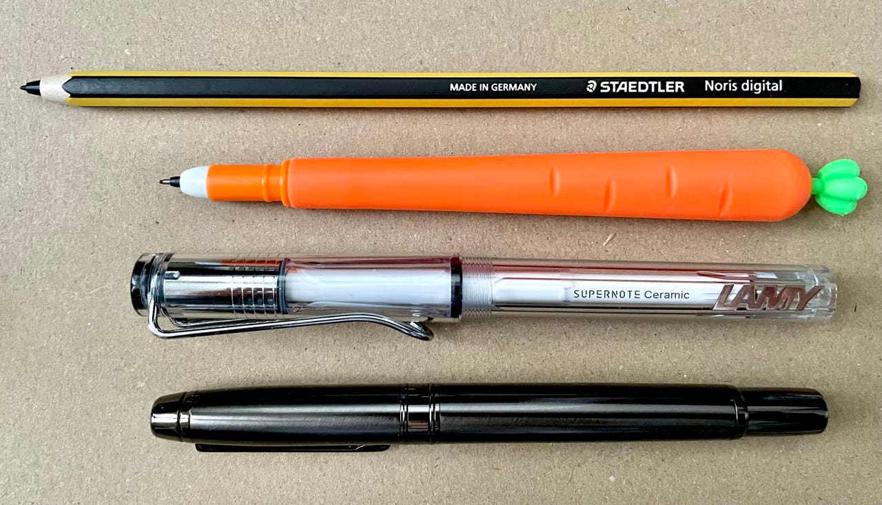
Lamy Safari Vista EMR Pen: is their newest pen model and collaboration with the Lamy company. I never used a Lamy pen before, but now I can see why many users love it. The pen is lightweight, well-balanced, and comfortable to grip. Paired with the Ceramic NeverReplace nib, it makes drawing on an e-ink screen an absolute dream.
HOM (Heart of Metal) Pen - Samurai version: These pens are heavier, and a lot of users love it for writing and taking extensive notes. The added weight gives you a steadier grip, keeping lines stable and smooth, but for long drawing sessions? Not my pick. It’s also a bit too cool to touch for me, and I really hate drawing with cold hands. However, I would carry this around when I’m out because it’s such a cool pen to show-off (laughs).
I also tested my trusty Staedler Noris digital pen (classic version), which I adored using on the Nomad for its rubbery, smooth, pencil-on-paper feel. But on the Manta? It was a NO-GO at first (almost got you there). Don’t be surprised when the rubber nib struggles against the plastic screen, creating much resistance. It can also get bumpy when doing sharp strokes. But as other users commented, the screen’s film needs a “break-in period” or you can season the screen with a damp micro-fiber cloth. Doing this will let the pen glide more smoothly.
Below I’ll share some drawings I’ve tested on the Supernote Manta. My goal was to see if it could handle producing quality work, and I think it’s safe to say, it’s getting there.
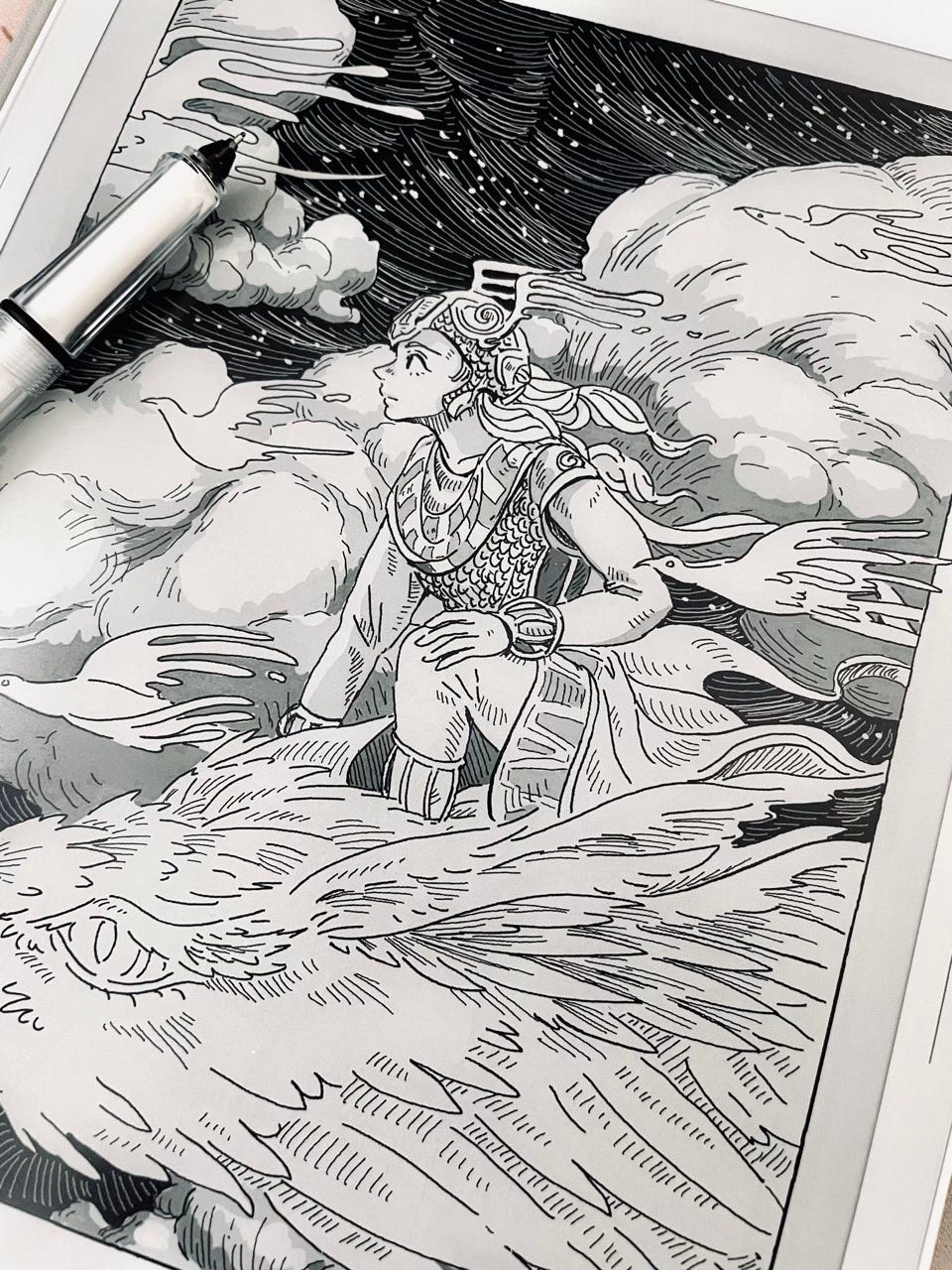
The First Sketch
I wasn’t completely satisfied with this first drawing. I thought adding color might improve it, but nope... It strayed from what I truly wanted to accomplish: to capture the charm of classic B&W ink sketches.
This piece ended up becoming a shaky experiment, because I was more focused on familiarizing myself with the bigger screen and different pen. I vowed to do a better job on my second one, and to stay true to my style!
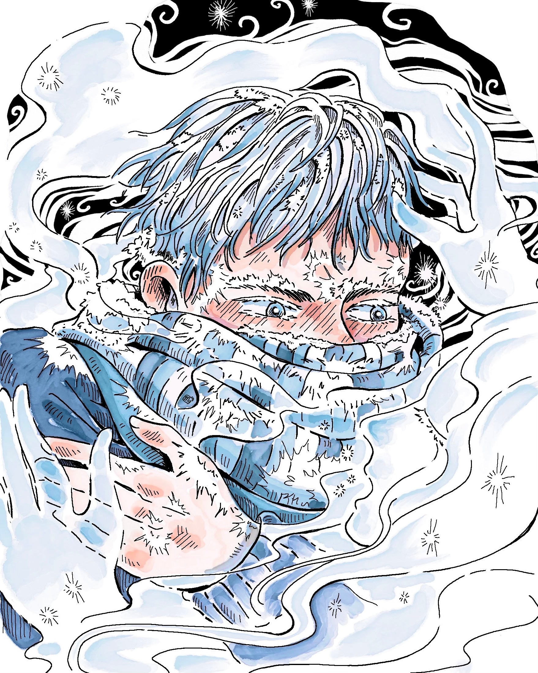
The Second Sketch
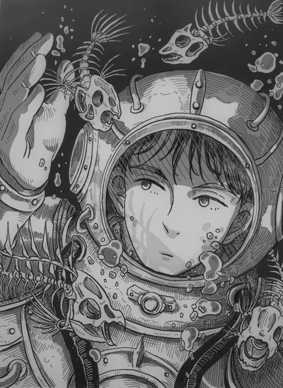
There’s a saying: “First the worst, second the best, third the…” whatever you grew up hearing is the third one. But I found this saying to be true for drawing as well.
My first attempt will always lack something, but I always do my best on the second round, it’s weird. And this time was no exception! The “deep dive” sketch above is by far my favorite piece of the year, because I have a secret love for deep sea exploration and space-like suits.
The Third Sketch
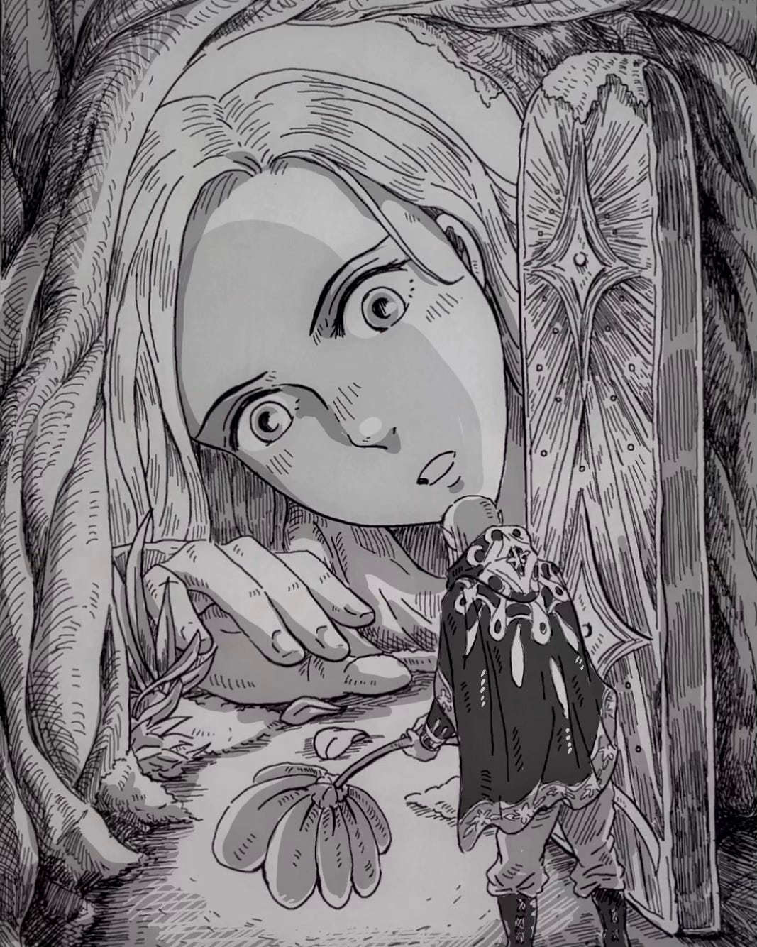
As for the third sketch, I didn’t enjoy the process as much as the second one. Probably because I was recording myself from start to finish, and drawing while the camera is rolling always makes me feel self-conscious. But I think I’m slowly getting used to it. You can watch the reel videos here.
I think it paid off in showcasing the e-ink charm, and I’m pretty happy with how it turned out. Plus, I love the story this piece seems to tell!


I’m quite set on making this digital sketchbook, a.k.a the Supernote Manta to be my staple drawing tool for upcoming projects, and I can’t wait to discover and push its limits even further.


I know the poll is just for the first three drawings, but the last one is so gorgeous too! I did vote for the second drawing though, those fish skeletons and the shadows they cast are just too cool
Those sketches look amazing! I recently got a Remarkable for writing purposes (I don't think it's that great to draw on compared to the supernote lol) but I love the versatility of e-ink tablets!